
Lenovo
Lenovo's First Commercial SaaS Offering
2018 - 2019 | Lead Designer
In 2018, when we kicked off the new Smart Office project, it included a Cloud-based Management Console where devices could be claimed, managed, and deployed.
I led the initial concept and in 2018, did a full tear-down and redesign to turn it into what it looks like today. In the process, we established a new Enterprise Design System for our Cloud services.
Business Objective
Create a SaaS Management Console that will claim, manage, and deploy ThinkSmart devices and provide real-time telemetry to IT managers..
Design Objective
Lead the design of the new company initiative including the UX, UI, UR, MVP feature set, and future backlog. Establish a new Enterprise Design System that can scale across new Cloud offerings.


BUILD A SOLUTION, NOT A PRODUCT
In 2018, the new Smart Office business set out to create a new platform that would help IT Administrators manage their conference rooms. The vision was to launch a Software-as-a-Service (SaaS) solution that would scale across numerous devices and businesses within Lenovo starting with Smart Office.

BACKGROUND
The first version of the portal was created from bootstrap libraries so we could understand the product positioning, the feature set, and get customer feedback. We updated this template accordingly, but realized quickly it wouldn't scale and didn't reflect the Lenovo brand. As the product matured, I took ownership of it and had to redesign it from the ground up.
The offering would be the first of many new Cloud-based solutions that would run off of Lenovo's new Cloud Platform. These enterprise solutions are important for IT administrators to track devices, gather telemetry data, and adjust their IT investments based on these insights.

GETTING STARTED
The current prototype and customer feedback showed that significant improvement was needed before we could launch the project. In the images above, the framework was not scaleable and there were many UX issues such as hidden menus and information and inability to quickly make important changes.
I started with some basic wireframes to explore some general layouts. I referenced many admin console templates and designs and chose this simple grid with a left column navigation.

![2019-03-18-Smart_Office_Console_Design [Recovered]_Device List V1 Gray.png](https://static.wixstatic.com/media/bf0e38_53a00580eec1406a854f39bd67de7d16~mv2.png/v1/fill/w_487,h_315,al_c,q_85,usm_0.66_1.00_0.01,enc_avif,quality_auto/2019-03-18-Smart_Office_Console_Design%20%5BRecovered%5D_Device%20List%20V1%20Gray.png)
QUICK MOCKUPS
After studying the layouts and graphical assets, I did more explorations for other pages of the console to get a sense of consistency and workflow. I added color to get a sense of branding, but my main goal was to see if this new design would stick.


![2019-03-18-Smart_Office_Console_Design [Recovered]_Device List V1.png](https://static.wixstatic.com/media/bf0e38_d4d3ca5087f046288784744a28c9b083~mv2.png/v1/fill/w_777,h_503,al_c,q_90,usm_0.66_1.00_0.01,enc_avif,quality_auto/2019-03-18-Smart_Office_Console_Design%20%5BRecovered%5D_Device%20List%20V1.png)
LAYERED INFORMATION
One of the biggest challenges was to provide enough information at first glance without overwhelming the user. I also had to ensure that information could be acted upon instead of confusing the user with inactionable CTAs and alerts. A firm balance between color and visual hierarchy was needed to achieve the appropriate experience for our users.
After many peer reviews, I applied this framework to more pages and workflows. I also needed to get the Software Development Team's buyin since this new framework would force them to rewrite a lot of the underlying codebase.
![2019-03-18-Smart_Office_Console_Design [Recovered]_Issue List copy.png](https://static.wixstatic.com/media/bf0e38_5deebf4f3c684342a9cfbb157a5019e5~mv2.png/v1/fill/w_777,h_503,al_c,q_90,usm_0.66_1.00_0.01,enc_avif,quality_auto/2019-03-18-Smart_Office_Console_Design%20%5BRecovered%5D_Issue%20List%20copy.png)
![2019-03-18-Smart_Office_Console_Design [Recovered]_Issue List copy 4.png](https://static.wixstatic.com/media/bf0e38_a26b070093a542dcb6290354c582f5dd~mv2.png/v1/fill/w_376,h_243,al_c,q_85,usm_0.66_1.00_0.01,enc_avif,quality_auto/2019-03-18-Smart_Office_Console_Design%20%5BRecovered%5D_Issue%20List%20copy%204.png)
![2019-03-18-Smart_Office_Console_Design [Recovered]_Issue List copy 3.png](https://static.wixstatic.com/media/bf0e38_fdbfecf186d34932b37e44eec8c4af88~mv2.png/v1/fill/w_376,h_243,al_c,q_85,usm_0.66_1.00_0.01,enc_avif,quality_auto/2019-03-18-Smart_Office_Console_Design%20%5BRecovered%5D_Issue%20List%20copy%203.png)
REPORTS EXPLORATION
Another aspect that I thought was missing was more visuals to help convey important information quickly. Since this was an admin console, IT admins were looking for new insights to help them make better and more informed decisions. When I explored ideas for a new Reports section, I made sure to include visual graphs.
![2019-03-18-Smart_Office_Console_Design [Recovered]_Device List V2 copy 5.png](https://static.wixstatic.com/media/bf0e38_7d75c78d965b4e87aeac41b7a9738768~mv2.png/v1/fill/w_777,h_503,al_c,q_90,usm_0.66_1.00_0.01,enc_avif,quality_auto/2019-03-18-Smart_Office_Console_Design%20%5BRecovered%5D_Device%20List%20V2%20copy%205.png)
![2019-03-18-Smart_Office_Console_Design [Recovered]_Device List V2 copy 2.png](https://static.wixstatic.com/media/bf0e38_a78be4f540604d979eaec4810700d44d~mv2.png/v1/fill/w_376,h_243,al_c,q_85,usm_0.66_1.00_0.01,enc_avif,quality_auto/2019-03-18-Smart_Office_Console_Design%20%5BRecovered%5D_Device%20List%20V2%20copy%202.png)
![2019-03-18-Smart_Office_Console_Design [Recovered]_Device List V2 copy 3.png](https://static.wixstatic.com/media/bf0e38_119401812f5c4b58871fb07219236a74~mv2.png/v1/fill/w_376,h_243,al_c,q_85,usm_0.66_1.00_0.01,enc_avif,quality_auto/2019-03-18-Smart_Office_Console_Design%20%5BRecovered%5D_Device%20List%20V2%20copy%203.png)
PREFERENCE TESTING
After I mocked up a few of the new designs, I wanted to get an idea of what users thought about the usability so I ran a quick N=30 online preference test via UserTesting.com. In this short survey, I provided some basic instructions for users on how to evaluate the designs including a Talk-Aloud task based activity, one section on aesthetics ratings, and one comparing the previous design with this one.
Overall, the results were extremely positive. We gained valuable insights about workflows and what pieces of information was the most meaningful for IT admins. We had enough information to continue with the redesign.
INITIAL WIZARD
One of the first things I tackled was the Initial Wizard that helped new users get started. There is a lot of information that must be collected before users can jump in so the Wizard was important in making a good first impression. It was also one of the first components needed to code so another reason I started with this experience.
I designed two options: one with a horizontal progress bar at the top and one with a vertical progress bar utilizing the left column.


We decided to proceed with the left column vertical progress bar. I felt this was the most consistent design based on the underlying framework.
Here is the following initial Wizard workflow.
Users are asked to fill out required information before proceeding. Once the correct information is inputted, the system would recognize the organization and direct the user into the correct portal with the right level of access. Each user must create their own profile in order to access the organization account.


I designed specific error states for incorrectly filled fields. I rolled this into the final Design System.

The final couple of screens deal with privacy. This was not a functional request, but a UX driven one. I knew that we would be dealing with user information so I proposed adding this screen to the workflow instead of hiding it in one of the information sections buried in the platform. I felt this was important as an IT Admin user.


CLAIMING A DEVICE
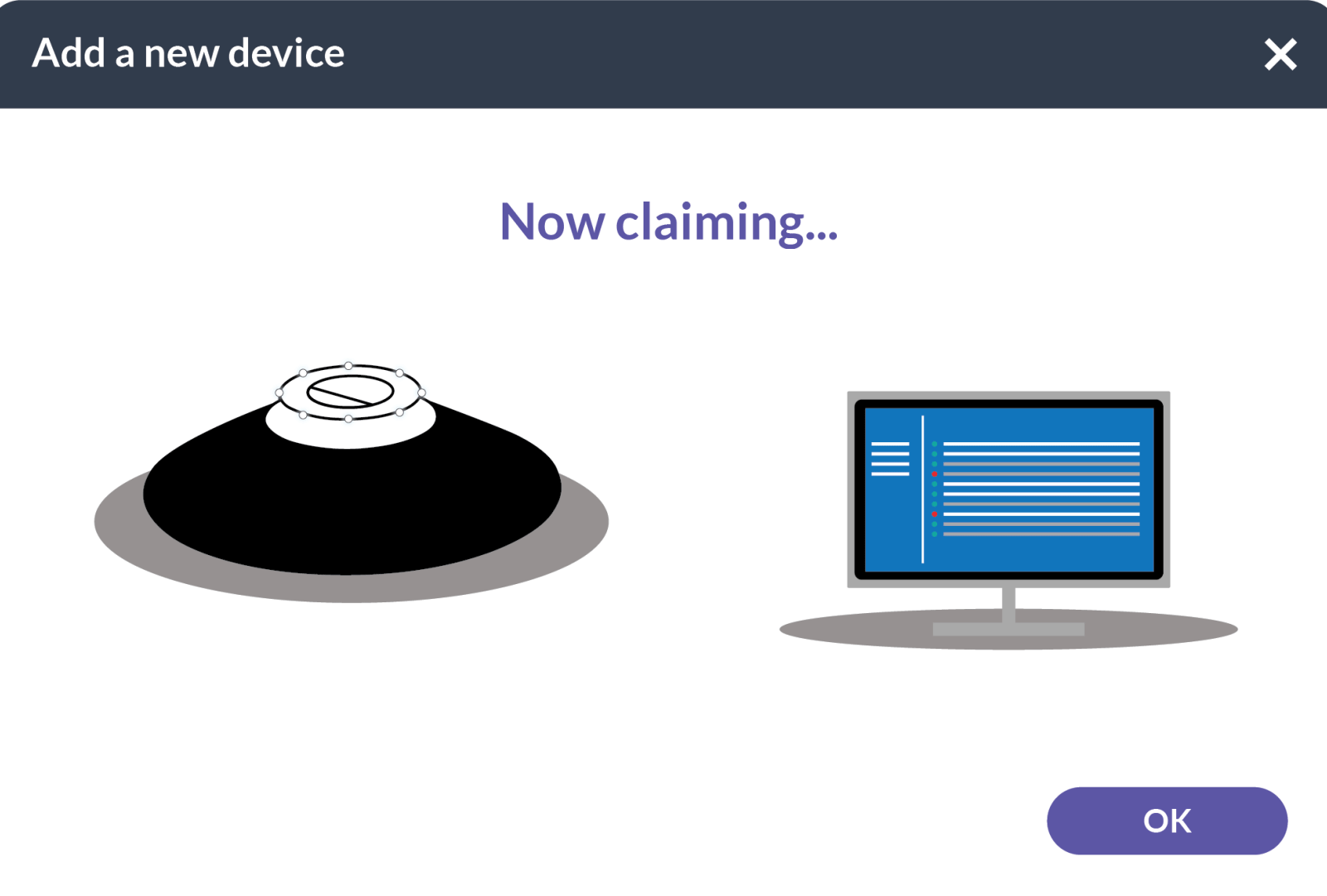
One of the most important tasks in the console is to "claim" a device or add a device to the account. There are a bunch of background tasks involved where the console and the device communicate to each other - similar to Bluetooth pairing a device. Since security and privacy are at the forefront of this solution, this step ensures that the owner has the right to claim the device and that the device can be claimed by said owner.
One of the ideas I proposed was providing animations to show the progress of claiming (feedback that something is happening). Sometimes this task can take up to a couple of minutes, so having feedback is critical to a good user experience.
WORKFLOWS
While I design this part of the experience, I had to build and update the workflows since there were many complicated parts. If an error occurred, I needed to understand where to put the user or how to inform the user on how to fix the issue. These workflows were used in our daily standup, grooming, and sprint ceremonies to keep us all on the same page.

CLAIM PROMPTS
The prompts started easy and got more complex as we supported different types of devices. Since I created the unique animation, I was the only one that could update it to support the new form factors and devices we supported later in the project.


Here is the animation you'll see when you successfully claim a device. The image on the left is the ThinkSmart Hub 700. We also support the ThinkSmart Hub 500, ThinkSmart View, and ThinkSmart Core amongst other devices.
The prompts are placed on the console over a transparency layer. Here are screens showcasing the final placement and design.


DESIGN SPECIFICATION
View my detailed design specification below. It was critical to get the details right so I chose to deliver a pixel-perfect spec over a live-spec (prototype-based).
LISTS
Here are the screens from the Device List (shown in light) and the User List (shown in dark). These lists use the same column-grid structure so that users have familiarity navigating the columns while developers can reuse many of the components. Both received a tad different visual treatment since I had not locked the Style Guide down at this point.


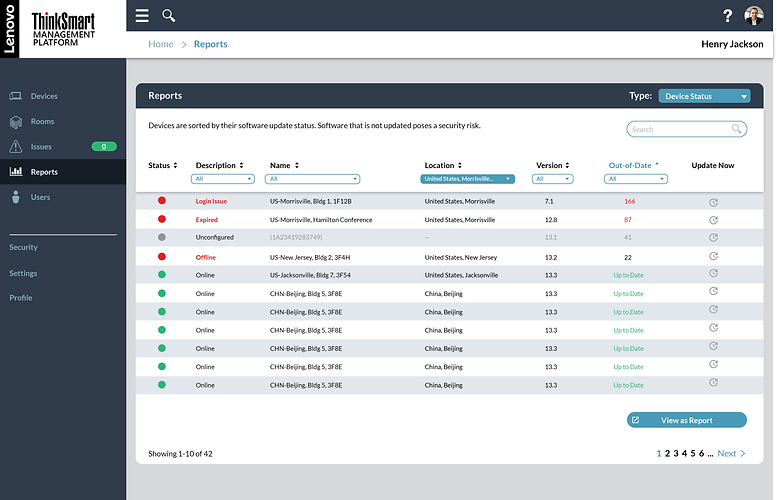
REPORTS
The next section I tackled was the Reports. At this point, we only had two options: Device Status Report and Rooms Issue Report. The information on each of the reports were very different so I had to explore what layouts made the most sense for each report. Here are two options for the same report.


MOCKUPS
Working through mockups, I tried to understand the usability of the layouts and what we could contain from a development standpoint.


I felt like we were missing a critical filtering system. Most reports have the ability to quickly and easily filter through the data to find something specific and we were asking users to comb through the data fairly manually. I added an option here with a left-hand filtering navigation.

This option, broke the sections into separate cards to keep the information clunked together.

VISUAL CHARTS
Finally, I wanted to make sure we had visuals in these reports so I provided some concepts on how we could add simple visual charts that would be meaningful to our users.

This one proposed the use of algorithms to predict future behavior which was a key insight in one of our early formative user studies.


Charts would be interactive and the data could be adjusted using the filtering system on the left. I also played with the idea of "pinning" one of these charts to the main dashboard for easy access and use.
EXECUTIVE DASHBOARD
The product definition did not call for an Executive Dashboard, but it was persistent in all my user research. In each study and conversation with customers, the need for an Executive Dashboard was at the top of everyone's list. They wanted one place to view all their data so they could grab the necessary information and present it upwards to their leadership without having to dig for it.
Also, many executives wanted access to the portal even though they wouldn't necessarily use it. An Executive Dashboard would give them a place to safety view the data without accidentially making unintentional changes.
Here are a few of my Executive Dashboard concepts which were used in the official definition of the products to customers and our internal leadership.


I explored various card layout options including the use of customization and personalization. Users would be able to drag and drop components into the grid and they would snap in place. Lists updated dynamically and would show which devices had issues and which users were currently online. This would serve as a one stop shop for IT Administrative Leaders.
OUT OF BOX EXPERIENCE
Less exciting parts of the experience were designing aspects such as the Out-of-Box Experience (OOBE) where special prompts and screens were needed to help users navigate their first time boot sequences. I would typically help create a flow diagram with the engineers and translate it into a UX workflow.


These experiences are sometimes difficult to design because they require the cooperation of our strategic partners and often blend the two brands together. In this case, we use part of Microsoft's boot sequence and have to use their design language to create specific prompts since they are loaded on the device.
ENTERPRISE DESIGN SYSTEM
It was time to pull all the designs together to create a unique Lenovo Enterprise Design System specific for our Cloud Services. Since this product offering was so different from other software we had designed, I needed to create it all from scratch.
I used the Design System methodology called Atomic Design to deconstruct the visual design and reconstruct the system in a coherent and meaningful way. This process tears the design into atoms and forces the designer to build the system one layer at a time. This was the first time we would apply this methodology to our work.
The first step was to create the "Atoms," the smallest parts of our Design System. These Atoms would be the building blocks to our interfaces. From there, we would develop Molecules, Organisms, Templates, and Pages.


USER TESTING
After we pulled together the initial Beta release of the software, we tested it across several user studies. These formal user tests were conducted with externally recruited IT Administrators that met a range of participant criteria including experience, size of company, gender, ethnicity, age, location, and dis/ability such as vision impairements. At least 2 participants in each study were red-green color-blind in order to check our designs for accessibility. We used a lot of red and green so we wanted to make sure the solution was still usable by this group of users.
FINAL DESIGN
Here is the final design. We have iterated the design a few times since launch, but the underlying framework hasn't changed. This framework was used for more than 8 different Cloud offerings after the launch of ThinkSmart Manager.
ThinkSmart Manager remains one of our most successful Cloud services.

MOBILE APPLICATION
In 2021, we launched a Mobile App version of the Console.

FUTURE CONCEPTS
As with any project, I created many future concepts that explored new technologies, new features and services, and different visuals. Here are a few of those concepts which we often share with our customers to get feedback.
The following explores groupings and foldering, global maps with analytics, more in-room telemetry data specific to online meeting information, and room and cubicle status based on proximity detection.


DESIGN EXCELLENCE
This design has won several global design awards and has been recognized as one of Lenovo's best new products. In 2020, several internal teams used the design to explore new service offerings such as the new Accessories Management Portal.