
Lenovo
Designing our Newest XR Experience
2019 - Present | Design Manager
My team designed the ThinkReality A3 experience from the ground up. We needed to have a design that was as elegant and sophisticated as the technology itself.
Our responsibility was to design the AR heads-up display launcher, mobile companion app, work applications, and a device management cloud portal. The final launcher is based on my design.
Business Objective
Design the user experience for the ThinkReality A3 that addresses critical issues from competitor products. Deliver the experience in 6 months for the first release.
Design Objective
Design a new AR experience (heads-up display, companion app, portal) that addresses critical user pain points. Rigorously test the designs with a diverse user base before delivering assets.


DESIGNING A NEW XR EXPERIENCE

"We were just asked to design the new AR experience for ThinkReality A3 and we only have 4 months to deliver it. Strap in, it's going to get bumpy. Let's have some fun!"
- Me to My Team in a Staff Meeting

- Also Me after said Staff Meeting
BACKGROUND
In December 2019, the AR/VR Business asked my UX team to design the Home Launcher experience. The ThinkReality A6 design was receiving negative customer feedback, especially around information architecture and visual hierarchy.
As the design manager, I had to first build a team that could support this request. I focused on identifying critical skills through a diverse lens. Creating inclusive technologies requires a diverse design team.
In 2020, I hired 8 additional resources to support this effort. Our multi-disciplinary design team included UX designers, interaction designers, an animator, developers, 3D prototypers, human factors engineers, and UX researchers that worked across 6 different countries and 8 time zones around the world.
We were truly a diverse team.

GETTING STARTED
Before we jumped in, I told my team to take home a headset and test the current design. I asked them to take notes on their experience to see if our opinions matched the customer feedback.
Each member was asked to complete several tasks, ranging from first-time boot to repairing a PC using the PC Repair Application. Over the course of several weeks, we gathered these insights and detailed them out in our UX War Room.
THE CURRENT EXPERIENCE
We quickly discovered the current experience wasn't very usable and that there were several poorly designed features. This design was created in 2018 by an external design agency who lacked AR experience. Unable to rapidly prototype and test their designs, it had many issues that led to a poor user experience.
1. VISUAL CLUTTER
There are too many visuals on the screen at one time which leads to visual clutter. Some information was important while others were rarely used.
The overall design takes up too much of the field of view. This is a big issue with AR since too many visuals will block the user's real-world view.

2. INACTIVE vs. ACTIVE
The interface is filled with both active and inactive (read-only) buttons and icons that look similar. Although this treatment felt like visual consistency, it adversely affects the experience since many users cannot distinguish one set from the other.

3. NO VISUAL HIERARCHY
Since all the icons, buttons, and read-only information are the same size, there is no visual hierarchy, confusing users on what is important or where to look.
This treatment made tasks more difficult to accomplish since they are all competing for the user's attention.

4. AWKWARD CONTROLS
The basic controls are awkwardly designed. For example, the Volume and Brightness controls are steppers, which makes it difficult for users to quickly move from one end to the other.
Other controls such as toggles are vertically designed with color as the only feedback. For users with visual impairments like colorblindness, this makes it difficult to know the toggle state.

5. NO EYE REST AREA
The experience uses an eye gaze input method, which means that whatever object you look at, you select it. This also means that if you are reading an object, there's a risk you'll accidentally select it.
In this design, there are not many places to rest your gaze when searching for the right button or control. Without eye rest space, many users selected apps or switched toggles unintentionally.

INSIGHTS + FEEDBACK
We spent the next few weeks talking with users from around the world. We wanted to listen to their pain points first-hand and understand what tasks they were trying to perform. We learned a tremendous amount of information from these discussions that we hadn't heard before.
This is why it's critical for designers to talk directly with the end users. It's always better than receiving the information second-hand.
BRAINSTORM
Next, we held multiple brainstorm sessions. I invited everyone to contribute ideas, regardless if they were a designer. This ensured everyone had a voice in the design process and gave space for them to be heard. And since we were extremely diverse, I knew everyone would come to the table with very different ideas. This inclusivity allowed everyone to participate in the creative process which is important in building team trust that's required in later stages of development.

UX ARCHITECTURE
After our brainstorm sessions, it was time to bring these ideas to life. Before we jumped into wireframes and mockups, we needed to understand the architecture of all the features and functions as well as the detailed workflows involved. We put together these initial architecture maps to help us stay lean and focused during the design process.


We also agreed to mockup the designs according to a set of defined user tasks (to establish a baseline) so that we can fairly compare designs against each other.
1. Home Launcher Experience
2. Change Brightness to Level 8
3. Connect to Lenovo Network
4. Launch Camera Application
5. Toggle Gesture Input to ON
6. Pin Camera Application to Home Menu
COMPETITOR LANDSCAPE
We also conducted a competitor landscape analysis to see the various interactions across the industry. We looked at all types of XR technologies to find patterns while conducting a proper comparion matrix of features and designs.

WIREFRAMES + MOCKUPS
The biggest challenge of creating these experiences is not fully knowing or understanding what the interactions would be like in 3D space. We referred to our user insights data, but many times we had to guess what the final 3D interaction would entail.
Below are various ideas created by me and my team.

CIRCULAR DESIGN CONCEPT
For this and many of my projects, I participated as both the design manager and as a designer. Based on the insights and data, I designed a circular interface and spaced out objects to minimize screen space.
I arrived at my concept because it solved two main issues:
1. It keeps the field of view open for critical information happening in the real-world
2. It provides an area to rest your eyes to avoid accidental selection with our gaze input modality


I focused on how users were going to use the device. Since it's a productivity tool, they were expected to perform important tasks in real-life. Directly blocking their FOV would affect their performance.
PHASE 1: EARLY PREFERENCE TESTING
It was time to get users involved. We spent several rounds doing internal experiment reviews (peer reviewing the protocols) before testing the concepts in user studies. We conducted a basic user preference test focused on:
1. Information Hierarchy (Architecture)
2. Intuitiveness & Cognitive Workload
3. Accessibility
4. Design & Aesthetics (User Interface)
Research methodologies included standard aesthetic testing (Aesthetics Pleasure of Design Scale), simple ranking and rating, and overall SUS score analysis with questions specifically targeting speed and accuracy.
The test materials were 2D graphical assets (mockups). We tested 3 unique designs and included the A6 Home Launcher design and a competitor interface as experiment controls. We took the constraints of 2D assets into consideration when analyzing the results since the fidelity added bias to the overall test. We acknowledged that looking at designs on a display is not reflective of the final 3D AR user experience.


"I think spacing out the elements and building layers of easy to understand controls will be essential. There are definitely some controls that are used more frequently than others."
(Participant 5)
"A lot of my hesitations in scoring some designs better than others is based on where my cursor is when I'm navigating. If I need to search for an object, I need a place to rest my eye without accidentially clicking something."
(Participant 11)
QUICK ITERATION
Based on the quick preference study, I was able to extract key insights to drive improvements to my circular design concept. I kept my wireframes neutral so we could focus on usability. Visual design treatments may inadvertently influence the user testing.


CIRCULAR DESIGN JUSTIFICATION
Here are a few reasons why I gravitated towards a circular design for this project:
-
A circular design would leave the center empty. This would avoid blocking the user's field of view and provides an eye-rest area to avoid accidental selection. This is important with unfamiliar interfaces. Users take longer to search for objects and need a place to rest their eyes.
-
This open area in the middle makes the design feel "light" since buttons are situated around the periphery. Visually, I avoided filling in the circles to preserve this airy effect.
-
In a circle, the distance between the cursor (defaults to center) and any object on screen is the same. In other designs, users may have to move their entire head to go from one side of the screen to the other.
LO-FI PROTOTYPING
After several rounds of internal design critiques and reviewing the data from the preference test, we chose 3 concepts to make lo-fi 3D prototypes. Our UX AR prototyper built the interfaces in 3D using a mix of Unity, Blender, and Adobe XD. We focused on activating the most critical paths for each task but also enabled most of the buttons to track error clicks during testing.
In addition to our own designs, we included three baseline prototypes to be used as experiment controls. The three additional designs were Daqri, Microsoft HoloLens, and our ThinkReality A6 Home Launcher.


Image Description: We created 6 lo-fi prototypes, including 2 competitor interfaces and the ThinkReality A6. Each concept was designed to complete each task so they could be fairly evaluated against each other. During testing, the concepts were randomized.
PHASE 2: FORMATIVE USER TESTING
Utilizing the lo-fi 3D Unity prototypes, we conducted our second round of user testing: this time, a more formalized study using internal stakeholders.
Our goal was to get user feedback on the prototypes, identify major themes and insights, and iterate our concepts before polishing them since each one took a lot of time to develop in Unity. We found several optimization techniques like using similar frameworks and assets to reduce the workload, but we were running short on time as the hardware schedule was being finalized.
One of our goals was to keep the test experiment and methodology consistent across phases so we could measure significant changes from one round to the next, particularly the usability and cognitive workload scores of our selected tasks.
The method we chose for this study was Think Aloud task-based testing that included time on task, accuracy, and task completion confidence. We used SUS-per-task scoring to measure usability and NASA TLX to measure cognitive workload as well as general ranking and rating scales.


DATA ANALYSIS
Here are a few insights from the formal testing:
-
9 out of 10 in-person users for this study were developers or people very familiar with AR. We wanted to ensure our designs met the needs of our most experienced AR users. We made a note to include a more balanced experience participation pool in the next round.
-
Tasks were simply a subset of available functions and are not representative of all features in the entire experience
-
Certain interaction methods had cascading effects for subsequent task performance. We randomized the concepts, but some users may have seen the same concepts in the same order.
-
We were unable to control environmental conditions (e.g., lighting, body position, objects in real-world) since testing was done remotely. Differences in environmental conditions may have affected results.
"I really liked the free real estate in the center of the design. It prevents accidental selection, especially when you're unfamiliar with the layout like in this study. When I had to search for something in a task, I needed a spot to rest my cursor so I wouldn't accidentially trigger something."
(Participant 2)
DESIGN ITERATIONS
Significant findings in the early user test allowed us to make critical changes to the designs. My circular design concept scored the best all-around, but as good researchers, we couldn't confidently confirm the results. After analyzing the data, we determined that the number of participants was too low, and the scores were not significant enough based on our pair-wise test. This was a difficult managerial decision because we were already behind schedule, but I knew we only had one chance to get this right, so I decided we needed an additional round of user testing with more participants.
Two of the concepts received significant redesigns taking into account the feedback from the study. The third concept, my circular design, which scored the highest, only needed a few updates.


I updated my designs to include user personalization, mini sub-controls, more colors with a focus on contrast and accessibility, and created visual hierarchy by differentiating objects based on their importance and frequency of use.
This version included read-only information in the center, a place for notifcations, and a quick trigger for voice input and feedback.
I also explored adding labels for accessibility and visual feedback on scales like Volume and Brightness.

PHASE 3: FORMATIVE USER TESTING
Using the updated 3D Unity prototypes, we conducted our third round of user testing. We worked hard on the experiment design to ensure that we could extract significant results and force a clear winner. We broke the study into three parts:
1. Internal Stakeholder Study via Head-Mounted Display (HMD)
2. External Online Global User Testing via PC
3. External Online Global User Survey
For the Internal Stakeholder Study, we recruited users who already had our A6 headset. The A6 was gaze-tech ready, which is the same techology the A3 uses. Participants were asked to download and install an .apk we developed for this study. The application was a self-assessed user study that walked participants through a series of tasks and had them answer questions about their experience. We also collected telemetry data such as where they looked, how long it took for them to complete a task, number of errors, and other data. The .apk was a true simulation of each of the concepts.
The method we chose for this study was Think Aloud task-based testing that included time on task, accuracy, and task completion confidence. We used SUS-per-task scoring to measure usability and Nasa TLX to measure cognitive workload and general ranking and rating scales.
For the second study, we used the same experimental design. Participants would walk through the same series of tests, but would do so on their PC. We created a tool that utilized the participant's camera to track head movement and linked this to the cursor to simulate the gaze cursor interaction. This was probably one of the coolest hacks we built to solve remote user testing.
Each of the prototypes allowed the user to select any object on the screen. For incorrect selections, an error appeared that allowed the user to go back to the previous menu. The user could end the task at any time by selecting the "Complete" button persistent on each screen. For this study, we also included two baseline prototypes: Daqri and the ThinkReality A6 interfaces.
Finally, for the third part of the study, we ran another online study that allowed participants to experience the prototypes without needing to install anything. We ran N=80 across various demographics, including users with/without experience in AR (differentiated between headsets and mobile). This was considered supplemental research to the previous studies because we couldn't control all the variables at play. By comparing sample sizes and extrapolating the data, we were able to decide if the results of this online study correlated to what we were seeing with in-person headset testing.


A significant bias in the study was that most of our internal stakeholders were all participants from the second round of user testing. This was due to limitations in hardware access coupled with safety restrictions resulting from Covid-19.
However, for parts 2 and 3 of the study, our participant pool was externally recruited users who had never seen any of the designs before.
FINALIZING OUR DESIGN DIRECTION
Reviewing the cumulative research data from Phase 1 to Phase 3, we concluded that my circular design concept was the clear winner. It had won in every round of testing and was backed by the data from our external survey. However, when we reviewed the data at the task level (SUS-per-task), there were many improvements still needed before the design was ready to go.
I tasked my team to come up with several iterations of the architecture that would solve some of the key pain points we identified across the multi-levels of testing. This activity capped our double-diamond design approach.

I next focused on program management, ensuring our schedule aligned with both software and hardware development. This is probably the toughest part of the job: negotiating time.

I commonly pull together schedules to ensure proper alignment with all the stakeholders and cross-functional teams. Since this is one of the first products where hardware and software are designed together, it was important for my team that I set forth a strict schedule that gave them adequate time to pull all the necessary assets together.
Often, UX is left out of the conversation and designs end up being rushed. Even worse, UX deliverables are misaligned in the Agile development process and specs are due the same sprint the stories are written. It's my responsibility to iron out all these details and empower my team.
DESIGN ITERATIONS
Based on all the data, the team got to work on iterating my circular design concept. I also iterated on my designs, but I avoided making any changes to the fundamental properties of what made the concept win in the user studies. This was extremely important. Sometimes designers update aspects of their designs that were already working well and as a result, inadvertently create worse experiences.


FINAL DESIGN CRITIQUE
When all the new iterations were complete, we let the team decide via anonymous voting. We placed all the concepts into a survey and reviewed the results together as a team. We used the tool Mentimeter to do live anonymous polling during this final UX review.

XR DESIGN SYSTEM
Since we now had our design direction, it was time to make it real.
The first thing we did was to deconstruct the designs into atoms and bits using the Atomic Design System Framework. I had originally used this method on a previous project and it helped the team scale quickly and preserve usability and brand consistency.
I wanted to build a new XR Design System from the ground up so that we could scale the design language across all our ThinkReality solutions including headsets, mobile applications, websites, and web-based solutions like our management platform. A3 would be the first of many new XR devices we would launch and we needed to ensure our design was flexible enough to cover various form factors.
I took the lead and built out the first version of our new XR Design System. We called it Interstellar.

DESIGN SYSTEM EVOLUTION
We started with 2D graphical assets, ensuring we created all the appropriate icons, buttons, and assets to get started on the specifications. Next, we created some of these assets in 3D using a mix of Blender and Unity. Then, we created Unity libraries that housed these objects so that our developers could work faster and more efficiently.
I eventually recruited designers to be fully dedicated to evolving this Design System as we started work on new future XR products.
DESIGN SPECIFICATIONS
After I laid the groundwork for the Design System, my designers started to create the design specifications, workflows, and user tasks for our development team. We also reviewed the extensibility of the design by applying it to other ThinkReality products and solutions such as standalone applications and our cloud-based ThinkReality Management Platform.
It was critical to get the architecture correct since this is where our developers would spend most of their time. It's also the most difficult to update since everytihng is essentially stacked on this framework.


Since there was so much to cover by our team, I jumped in and helped design different aspects of the experience including the notifications and boot experience. This was in addition to helping support many technical aspects of the hardware design.
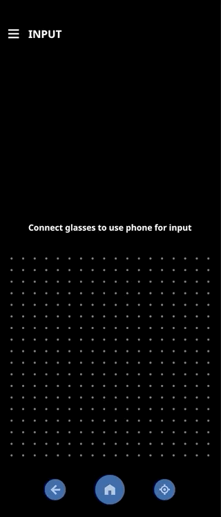
COMPANION APP
A critical aspect of the overall experience is the Android Moto Companion App. Midway through the project, the business decided to pivot our compute source from a dedicated box to using Motorola's G100 flagship phone. Up to this point, we were relying on using the box for physical input navigation. After the decision was made, we had to assemble a team that could design the companion app experience.
The Companion App not only provides input controls, but it also allows users to tap into a blended mobile experience. Our roadmap included numerous feature possibilities over the next several releases. By using a mobile device, we were a small step away from ubiquitous AR mobile computing.

WORKFLOWS & WIREFRAMES
We first had to work out the initial Release 1 functional and feature requirements and then pull back to think about the long-term roadmap. We needed to build an app that could evolve over time, especially with the addition of new complex features like Ray Casting and Gesture Controls.


1. LAUNCH HOME
Provides a quick option to pull up the Home Launcher from the mobile device, especially if the glasses have gone to sleep.
2. NAVIGATION

Using the digial touchpad, navigate the Home Launcher. Great option for those who want to turn off gaze navigation.

3. SELECTION
Tap to select using the digital touchpad. An option when gaze-dwell selection is turned off.

4. RAY CAST
Using Ray Casting as an input modality for navigation and selection. We had to prototype and test this behavior several times since we struggled to find the ideal default position for the ray cast.

5. RAY CAST
We also needed to work out the Ray Cast behaviors when objects were pinned to the real-world. There were many subtleties that could adversely affect the user experience.
SETTINGS & TOUCHPAD
An advantage to having a dedicated mobile companion app was duplicating the settings from the Home Launcher to make adjustments more quickly and easily. Most of the settings could be changed with the Companion App. This would avoid having users perform these adjustments using gaze-dwell. Another advantage to having multiple input modalities is accessibility. If one user cannot use a specific input, they would have several other options to select from.


QUICK PREFERENCE TESTING
We continued to preference test individual workflows, actions, and visual assets as we designed out different use cases and scenarios. Quick A/B testing allowed us to stay nimble and make data-driven design decisions before delivering final designs.
Since we ran so many preference studies, we developed simple templates that the whole team could use. We had access to several research tools like UserZoom and UserTesting.com so we could get a study up and going and the results back within just a couple of days. Internal testing could be performed even faster. With all these tools, we were able to move quickly and be confident that we were on the right track.


Image Description: This is a sample of a preference study that used the simple template. We needed more information about our cursor such as the appropriate color with that right contrast ratio, how large to make the cursor, how opaque, how fast should the selection animation be, etc. This study was conducted with N=60 globally within 48 hours. These key insights helped us pitch the need to provide multiple options for users instead of a relying on a single visual design.
ACCESSIBILITY
Designing inclusive and accessible technologies is at the heart of our team. In 2019, our UX team launched the Diversity by Design Review Board (DDRB), a special group of UXers that ensured all the products we created met accessibility standards amongst other diversity criteria. They work with several cross-functional teams from hardware and software development to product marketing and quality.
Since they were a part of our larger UX team, we worked closely with them to ensure we were meeting all their guidelines. This meant that we had to test our designs with a diverse group of participants (across several criteria), test our designs with people with dis/abilities (within limitations), and provide rationale when we couldn't meet a specific target such as providing users with hearing impairments an alternative option (technical limitation).
In addition to these guidelines, we also adhere to standards on accessibility and rigorously test our designs on color selection and contrast ratio for users with vision impairments. We provide labels and text transcriptions where possible. Our products must pass the DDRB review before we can formally launch it.

Image Description: A snapshot of accessibility standards we use to review our products.
INPUT MODALITY FLEXIBILITY
One of our goals to address accessibility was to provide as many input modalities as possible to cater to the unique differences of our users. The default input modality is eye gaze with dwell selection. However, we acknowledge this input may not work for anyone so we also provided input via the companion app, hardware buttons on the HMD and phone, ray casting, and are working on gesture-based inputs and voice input which will be implemented in future releases. Having multiple options for input increases the accessibility and use of our product which will benefit everyone.
FIRMWARE SPECIFICATIONS
Interactions on displays go beyond the visuals. My team must also provide the specifications for each behavior that occurs across the physical experience so we can translate those requirements into firmware specifications. Often, a specific behavior may require the system to execute a task, which means we must detail out those behaviors and how the system responds.
For example, a common firmware behavior is volume control. There are many ways a user can adjust the volume and we must detail out what happens in all those scenarios.
A separate firmware specification is packaged with our design specifications.


INTRODUCING
THINKREALITY A3


RECOGNITIONS
ThinkReality A3 was launched in 2021
Our designs have won several global design awards including Red Dot, iF Design Award, Good Design Award, and Time Magazine's Best Inventions of 2021!
UPDATES
ThinkReality A3 has had four major releases since its launch that continuously improve the experience. We have added several new features and applications that leverage our sophisticated technology. We continue to run frequent user testing on new interactions to ensure we are always improving our usability.
In August of 2021, we ran a large N=120 in-person user research study that focused on both hardware and software usability. This research highlighted many insights that we fixed and improved. Overall, the study scored an 82 SUS which was evidence of all the hard work my team has put into this experience.