
Lenovo
Leading Lenovo's First Commercial SaaS Offering: ThinkSmart Hub 700
2016 - 2019 | Lead Designer
As the world's largest PC company, Lenovo launched adjacent solutions for the enterprise space starting with office collaboration devices.
I led the design of our first hardware & software solution including UX, UI, and User Research. It was the first time Lenovo developed a HW+SW solution from
Business Objective
Lead the launch of Lenovo's next Billion-Dollar business in Smart Office solutions including hardware, software, and services.
Design Objective
Provide design leadership across all products and experiences to get this new business off the ground and achieve revenue milestones.


WHY I CAME TO LENOVO
2016
I joined Lenovo to take on the challenge of turning an idea into a new business opportunity. My responsibility was to lead a new emerging business called Smart Office which focused on dedicated collaboration devices for the workplace. Working closely with the Next UX team, we brainstormed, ran workshops, reviewed competitor products, analyzed market trends, interviewed customers, and finally, designed the solution we knew would transform the collaboration industry.
We started with this question:
What do our customers actually want to do?
MARKET & USER RESEARCH
We visited several customers to listen to their pain-points, view their workspaces and technologies, observe their ways of working, and most importantly, identify their needs.
We can always solve issues, but our goal was to identify the correct ones.

Image Description: This was a photo of one of our customer's conference rooms. It's common to see various technologies, cables, devices, and information placards taking up most of the table.
We compared these learnings with our market research data. We found that companies were looking to improve their conference room experience and invest heavily in it over the next 5-10 years. Meeting room frustrations remained one of the top issues for office productivity and we wanted to find a way to solve it.
We also found that companies were looking to invest in smaller rooms called huddle rooms. These intimate workspaces were more popular than large conference rooms that are rarely fully occupied.


Our focus was to provide the best holistic user experience to our customers. This meant that hardware and software had to seamlessly work together which also meant they had to be designed together.
This was the first time Lenovo would design the hardware and software together from the beginning. Our next step was to figure out how we would actually do it.
My role was to lead the design and strategy from idea to production.
The challenge was that this was new territory for Lenovo and I was literally on my own.
IDEATION
In the beginning, we explored several ideas using all sorts of mediums: white boards, sketching, prints, Post-its, videos, word play, charades - anything that could get ideas flowing and discussions moving.
THE GOAL
During our brainstorm sessions, our main goal was to establish our MMF list for Gen1. There were so many features we could cover, but we knew we had to focus on simplicity and evolve from there.
Here was our criteria:
-
What was critical to the success of this project and how would we measure it?
-
What features could we roll out as Over the Air (OTA) updates instead of squeezing it into Release 1?
-
What would make the rest of the industry nervous if we solved it?

LO-FI PROTOTYPING
From wireframing to mock-ups, I generated hundreds of layouts, grids, and frameworks focused on minimizing user friction and designing for the most common use cases. I knew that if we could predict what users would do most of the time, it would boost their positive experience with the product.
I studied several interaction models and created more than 10 different working prototypes for both internal review and external user studies.
The biggest challenge was designing for a large display that would be several feet in front of the user. It was similar to navigating a streaming service on a family room TV. We would need to design the experience to scale across different formats and form factors.


FORMATIVE USER TESTING
Next, I took my prototypes on a roadshow and ran demos for internal stakeholders, large enterprise customers, and formal user research participants. We gathered feedback on our product definition, MMF feature list, and recorded any specific use cases or environmental constraints we hadn't considered before.

1: FORMAL USER TEST
In April 2017, we ran an in-depth 15 person user research study to get initial feedback on the product, the user experience, workflows, features, and value proposition. It was conducted as a mixed methods, Talk Aloud, task-based study with SUS and NPS.


Participants were asked to comlete a series of tasks without instruction, using a mouse and keyboard for navigation while viewing the interface from a large display placed at an appropriate distance from them. We tested legibility, workflows, errors, and had participants walk through what steps they expected to perform the tasks.
Participants varied in experience with collaboration tools and online meeting platforms such as Slack, Skype, and WebEx. Most worked in office settings where they were expected to share content remotely at least 3-5 times a week.
We achieved an 88 SUS score in our test, which was one of the highest scores we've ever recorded. We were now ready to pitch our idea to leadership for investment.
PROJECT KICK-OFF
Over the next few months, I demoed the software prototype to several key executive stakeholders across Hardware and Software Development, Strategy, Research, Investment, Operations, and Customer Experience.
In September 2017, we received official approval for the project and off we went. A couple of days later, I flew to Yokahama, Japan to formally start the project. Over the next several months, I designed the entire software platform focusing on core design principles and keeping the customer at the center of my design process.

It would be an understatement to say that
designing this software was difficult.
HARDWARE LIMITS SOFTWARE
A simple way to describe the job is that I had to design every feature that Skype and Zoom could do, but I could only use two buttons to do it. This was because we decided on overly simplified hardware controls. The idea was to mimic the iconic interface of the iPod to reduce user confusion and place the user's attention towards the front of the screen during the meeting.


The hardware was designed with the focus of "making meetings simple."
With a powerful i5 Intel processor, an array of mics and sensors, high-quality LEDs, and premium Dolby Voice Audio, the ThinkSmart Hub 700 is one of the most powerful and premium conference room devices in the market.
PROJECT SCOPE
Based on the project definition, we knew we needed a full turnkey solution.

For software, there were four main components:
1. Room User Interface
(application on the hardware)
2. Companion App
(application on Windows client devices such as PCs)
3. Companion App
(application on Android client devices such as mobile phones)
4. Administrative Management Console
(web-based management platform)
I led the strategy, design, and implementation of all these products.
ADMIN CONSOLE
Device deployment, management, and maintenance would be driven by an administrative management console built on a web-based platform. The Portal provided device customization parameters, meeting and device telemetry, and customer account information including billing and licensing.
We agreed to start with Boostrap libraries and a prefab template to meet the aggressive timeline and our MMF Release 1 scope.


THINKSMART MANAGER
After Release 1, I was in charge of scaling the detail of this Admin Portal to a new suite of Cloud-based enterprise products under a new Cloud portfolio. Visit my case study on ThinkSmart Manager to see how I redesigned this product, launched a new Enterprise Design System, and helped build Lenovo's Cloud Services.
DETAILED DESIGN WORK
I knew we had to make this product look as elegant and refined as the rest of our Think portfolio so I concentrated my effort on a few screens that would be used the most.
I focused on the following:
1. My preliminary wireframes and prototypes
2. Corporate branding guidelines
3. Market and customer data
4. UX research study results
5. Fundamental UX Design Principles

I spent the very first day doing lots of math.
I used a 4K HD resolution canvas and created my column-grid structure to fit within the pixel constraints. I used a 4 column grid with 2 half columns on each side nestled within equal outer padding. I wanted to ensure that the last CTA was visible enough so users would know content existed beyond the visible interface.
This screen shows the number of connected content and a preview of that content. I also needed to ensure the text was visible from several feet away and the contrast was acceptable by users with vision impairements.
I ran multiple calculations to ensure all the content would fit within the grid and confirmed the app would scale, adapt, and respond correctly across various display resolutions and devices. I tested these with several monitors we had in our lab and in several of the conference rooms on-site.
Next, I designed several frameworks to see if the grid would hold up for all our use cases.

The most important factor to the grid was ensuring proper legibility at various sizes and distances from the display since this interface would be displayed on a large TV in a room.
It was easy to test this by projecting the UI on a room display and letting users read the content at different locations and distances from the TV. I used anthropometric data to define the distance of readability and compared the results to several literature reviews and human factors guidelines and standards.

THINKSMART HUB 700 TEASER
Here is a short video I created of designing the calendar view for ThinkSmart Hub 700.
WIREFRAMES & WORKFLOWS
I sketched out several wireframes to ensure that I incorporated all the features and content correctly then used them across workflow maps and user flows to map out various use cases and user behaviors. I spent months discussing the various use cases in detail and then used that list to serve as our SW feature backlog.
I ran through the use cases many times to test the logic and map decisions, clicks, navigation, and overall ease of use. We referred to these workflows throughout the development process to identify if there were any missing interactions. The workflows were also used by our Quality Team to test the code against my design specifications.

Using these workflow explorations, I was able to run various permutations to find the path of less resistence, the least amount of clicks, the most intuitive steps, and the most predictive behaviors.
These were important in finding the ideal solution and defending design decisions. They also helped to optimize my designs and compare them with competitor products and solutions.

PROOF OF CONCEPTS
I ran endless design studies, workflow explorations, design critiques with both people on and off the team, and numerous formal user studies. But some interactions needed something more to get right. For these complex workflows, we had to build mini proof of concepts (PoCs) to test out the interactions. For example, if something required a timed event that couldn't be simulated through prototypes or if we wanted to test the quality of a specific feature like streaming content from a phone.
I worked closely with a few developers to quickly create and build these PoCs so we could evaluate the design and use them in formal user studies.

This is an example of an art board that explored various options on selection.
Over the course of the project, I created hundreds of art boards to detail user interactions, workflows, and designs of each screen across several use cases and behaviors.
Design studies focused on not only various display resolutions but also various types of information that might be displayed at any given time during the experience.
For example, considerations were made for long names, maximum use cases (max number of devices and users sharing in one meeting), various time formats, legibility, accessibility, and language translations.


I created a site map outlining the overall UX architecture. These site maps were extremely important in getting everyone on the same page, especially all the developers who worked across the world.
After seeing the site map, stakeholders realized how simple the interface was and found ways to optimize the code based on this UX architecture saving not only time, but computing power.
DESIGN SPECIFICATIONS
The next few months were dedicated to creating detailed design specifications that would outline fonts, colors, behaviors, interactions, assets, and even audio behaviors.
Here is the transformation from prototype to final design.

Room UI Prototype


Companion App Prototype

Room UI Final


Companion App Final


STYLE SHEET
One of the most important parts of the project was translating my designs into detailed specifications.
This was one of the most challenging tasks of my career: to create a single document that would be robust enough to handle millions of data points and could be updated frequently as the design changed throughout the development process.

The final draft of my Master UX Specification consisted of more than 1800 pages of detailed user behaviors, spacing, features, assets, fonts, colors, interactions, audio, and animations.
I decided to stick with a traditional design specification for this project because of all the stakeholders around the world. Some parts of the spec could have been created using a live prototype, a technique I've used on most of my UX projects, but our software quality team needed to have a physical reference guide to check the various use cases we had to design.

Image Description: Example of the Overlay Menu layer design


PRODUCT BRANDING
The ThinkSmart Hub 700 needed a brand. Traditionally, this responsibility falls under the branding team, but I decided to deliver one.
Below is the product icon I designed for the Hub app.


The design was created to reflect a group of people coming together for a meeting. The huddling is a play off of the term "huddle room." I used the logo to create two separate loading animations:
Starting Your Meeting
Ending Your Meeting
These screens are important as many background tasks must be executed before the meeting can be properly joined or ended.
CUSTOM WALLPAPER CONTRAST STUDY
I also conducted design studies to ensure that different customer brands would work well within our app. We had a custom wallpaper feature in our Admin Console that allowed users to upload a background to the room UI. When the room was empty, the wallpaper would be used as marketing material. This exercise also helped define the final colors we used for our button states in order to:
-
Ensure high-contrast for legibility and accessibility requirements
-
Produce a distinctive hierarchy to highlight the in-focused CTAs
-
Adhere to strict branding guidelines


Image Description: These are samples of customer wallpapers applied to the design. The first is from GE and the second is from Johnson & Johnson. When the room is not in use, the UI fades away and the wallpaper is left in full transparency as marketing material.
ACCESSIBILITY
It is critical to design for accessibility. Ensuring the app has high-contrast options for visually impaired users is an important part of my design philosophy. I proposed a separate development team work on a high-contrast version of the UI and designed the new offering in parallel.

When selecting colors, fonts, and other patterns, I checked them across various types of color blindness tests, which is an easy way to identify accessibility issues.

I ran a series of studies to understand how people with vision impairements would use my design and made adjustments to the colors and assets as needed.

I always design with language translations in mind. I use a set of languages for my baseline and adapt the English version as needed. As shown in this image, some translations stretch the design in many cases so ensuring the design adapts to these translations at beginning of the project will save a significant amount of time in the end when your product rolls out globally.
FORMATIVE RESEARCH TESTING
After we had a beta version of the software completed, we wanted to do more user research to see if there were any other UX gaps we had not addressed. In this study, we ran N=30 externally recruited participants with similar participant criteria as previous studies - a blend of online meeting experience (Zoom, Teams, WebEx, Chime, etc.), presents work in at least 3-5 times a week, and communicates with multiple stakeholders across the world.


RESULTS
The results from this study gave us confidence to continue developing the solution. Most users were able to perform all the tasks and only had minor issues with the system. We achieved a SUS score of 80 and hit many of our UX metrics. This was another important data point in convincing leadership we were close.
SCOPE CREEP: DIALING
Near the end of Release 1, we were told our original plan for a hardware dialpad device was canceled. Since the product needed to support dialing at launch as part of our MMF, we were left with solving the need with a fully digital experience.
The problem was that we only had TWO buttons to dial numbers and search for people.
As the designer, I was tasked to solve this problem and present solutions to the Executive Leadership Team within a month to keep the project on schedule.
Below are some initial dialing design mockups and prototypes I created.


After a couple of quick hi-fi prototypes and PoCs with real code, we ran several user studies. The results of the studies showed that this design was the clear winner:


The beauty of this design was that it was reflective of the hardware and provided a nostalgic reference to old rotary telephones.
People just got it.
After I received Executive approval, I was off trying to make this design interface work. I carefully crafted the UX architecture and wrote out backend logic for the developers to follow. This included timing, interactions, algorithms, and information hierarchy.
The only gray area was what the SDK could provide in terms of dialing features which we would only know once we started to code it.

I also recommended we add a dialing feature into the companion app, which meant I had to design the new feature and map out the workflows on how the app and room would seamlessly integrate and work together.
This task was incredibly challenging because there were several unknowns.


SOLVING NON-DESIGN PROBLEMS
Throughout the project, I worked closely with developers to not only help them design the app, but also to help them code it correctly. We added a lot of "smarts" into our solution from meeting management to when the help animation would appear. All these little behaviors required lines and lines of code, which I helped write.
Below is one example where the team asked me to help them with the logic behind our meeting countdown timer across the various use cases.


MORE USER RESEARCH!
When you develop a brand new technology, you also create a brand new experience.
Our biggest question was if this new experience was intuitive for users and how adoption would affect the overall experience.
We understood there would be a learning curve to our solution. How steep the curve, we didn't know. Throughout the project, we conducted several usability tests from preference testing, exploration and concept testing to in-depth task analysis utilizing standards like SUS and NASA-TLX. We tried several mixed methods research activities to uncover usability issues and identify UX gaps.
For all our all studies, we recruited specialized users such as IT Decision Makers as well as general users with experience across various Unified Communications platforms. We also recruited across other demographics such as location, age, race, gender, education, and even company industry.

In this study example, we asked IT Decision Makers to conduct a typical meeting using our solution. They had little to no instructions on how to get started and even tried new ways to run the meeting as they discovered new features along the way.
This picture was taken behind a single-sided mirror in our usability lab. The users were given all the devices they typically use in a meeting or brought their own devices to the study.
NEW USER INSIGHTS: LEARNING CURVE
Our hypothesis was correct in identifying a new learning curve. However, the results weren't as steep as we had expected. Once the user learned the controls of the hardware, they were able to navigate the system with ease and because we designed the UX to be "forgiving," mistakes had little to no consequences to the experience, which made users feel comfortable clicking and exploring new features at will.
So how do we lower the learning curve?
Our first thought was to provide printed marketing materials, but we also knew that many users would not read the instructions prior to using the solution. Knowing this, I designed a Quick Start Guide that would be shipped with the device so that companies could place it near or around the device in the room. I wanted to design something unique instead of another heavy-text IT placard.
It worked. It worked very well.

VIDEO TUTORIALS
Then, we decided to take it a step further and invest in professional tutorial videos. We hired an agency to film 30-second videos for the most common user tasks and use cases. These tutorials were placed into a Help Section in all the applications and also posted online.
I volunteered to be in the tutorial videos. What they say is true: videos speak louder than words.

Here are some of the marketing promo videos that were released with the launch. Many were produced and sponsored by Intel.


FINAL USER TESTING
After integrating the tutorial videos into the app, we ran several more studies that focused strictly on intuitiveness to address the learning curve issue we identified in the usability research study. We ran a very similar stury so we could correlate the test results to see if there were any significant improvements.
Our results significantly improved with the added HELP content. This was reflected in a significant increase in the SUS score (per task and product) as well as the overall NPS.
We had solved one of the last remaining UX issues and were ready for launch!
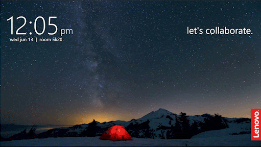
Introducing
THINKSMART HUB 700


GLOBAL RECOGNITIONS
ThinkSmart Software was recognized and honored with:
I was honored to receive the Red Dot Award at the Red Dot Ceremony in Singapore in October 2019.


