
Delineation
Architecture Firm Corporate Identity
2013 | Design Consultant
In 2013, the owner of Delineation took full control of the architecture firm and wanted to rebrand the company to reflect its new culture and values.
The project was about a month and included branding, templates, and print materials.
Business Objective
Create a new and unique identity that has both a modern and creative feel.
Design Objective
Rebrand the company to update its visual design while incorporating more architecture elements.
STARTING FROM SCRATCH

BACKGROUND
When the company was founded, there was no investment made to the company's brand. When I was asked to help create a new company identity, I started with a clean sheet.
"How do you want your customers to think of you?"
I first asked the partners to describe their company using as many descriptions as possible. I then asked them to describe what kind of company they wanted to become and correlated the two lists. I used simple diagrams to illustrate the strongest areas that stood out and focused my attention on how we would get there.


EXPLORATION
I next wanted to determine which typefaces we would go with so I could understand how the font families would impact the rest of the company's identity.
I knew I would have to blend multiple font styles in order to truly capture the essence of passion, fresh, and creativeness.


In the Exploratory Phase, I studied a number of combinations of type and logo in order to capture what the client desired. This phase is critical to the creative process, which allows me to truly review all my options prior to selecting the most elegant solution.
Concepts ranged from conservative approaches to wild ideas blending various architecture and design references.

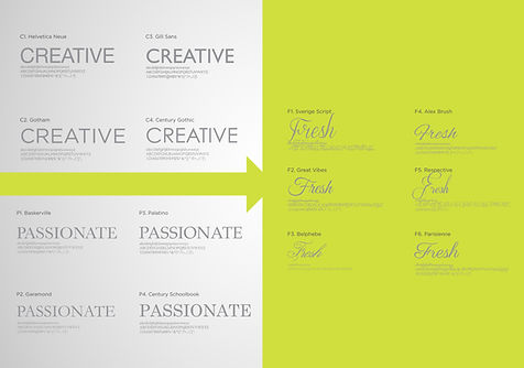

Next, I selected a few options to expand upon and focused my attention on detail and execution.
LET'S FOCUS


EXPRESSION
Keeping in mind the three core areas, I now wanted to integrate the creative and architectural side of the firm.

Needing both a wordmark and a unique logo, I decided to combine a couple of different ideas to truly capture both ends of the creative spectrum.


THE FINISHED PRODUCT
I decided on an all-lowercase, creative font for the company name supplemented with an all-caps san-serif description to really blend the creative side with the professional side.
I created a separate company logo with a strong brand appeal so it would be recognizable without the company wordmark.


PACKAGING IT
From company colors to print materials such as business cards, store decals, letterhead, and invoices, I created a brand guideline and provided all the necessary print materials through my other company, Arrow Reprographics, Inc.


SAY HELLO TO DELINEATION


